Purple is my least favorite color.
Here we are in 2022. Still in the midst of a pandemic, on the brink of war, and in the middle of massive social disconnect and upheaval. Black seems like a good color (hello darkness my old friend). Or maybe red (warning!). But somehow we find ourselves in the year of periwinkle / lavender / purple-ish.
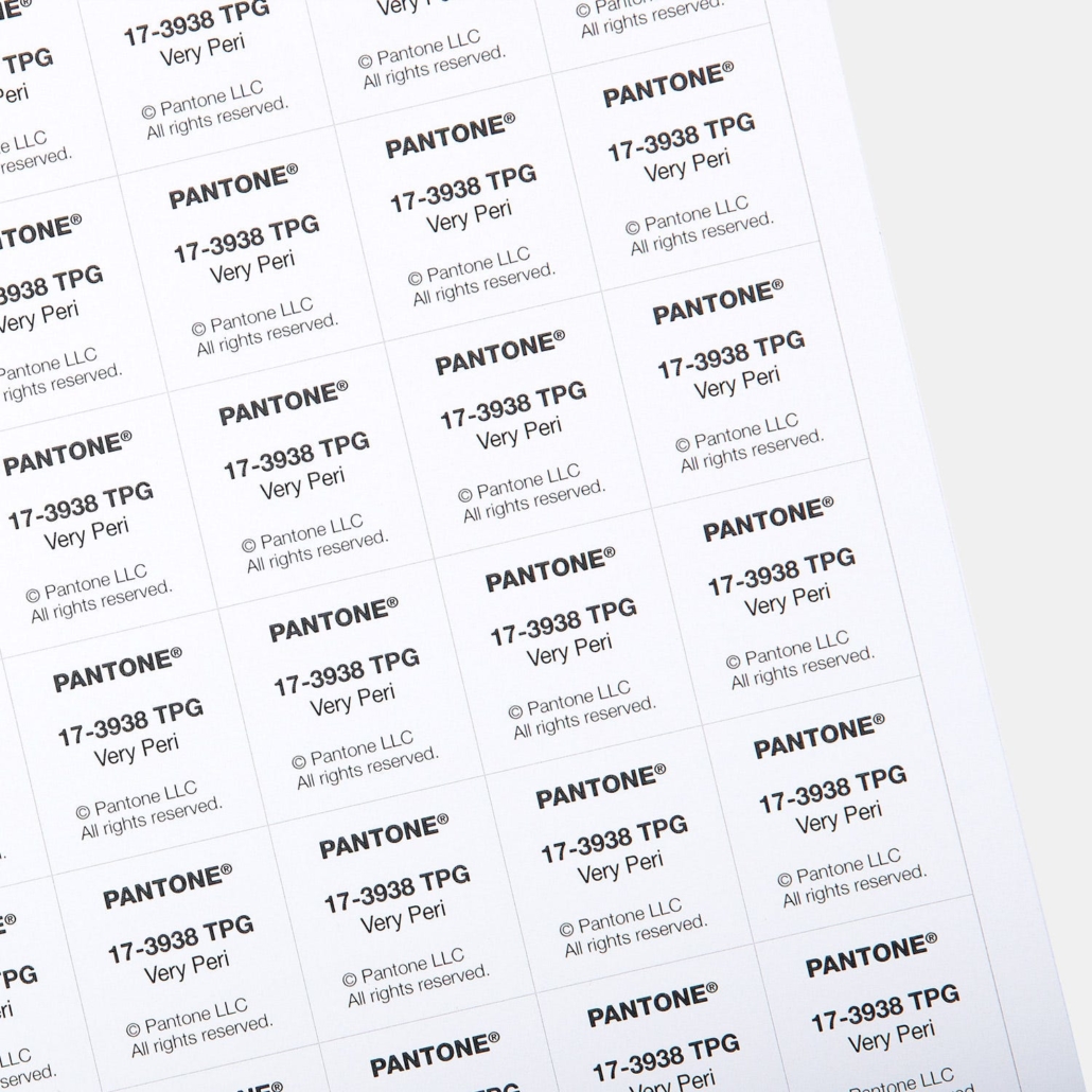
Pantone (combining ‘pan’ and ‘tone’ means ‘all colors’) developed the first color matching system in 1963. This system allows designers like myself to see the exact color ink will look like on paper, while enabling printers to use that same standardized system to match the ink color on the final piece.
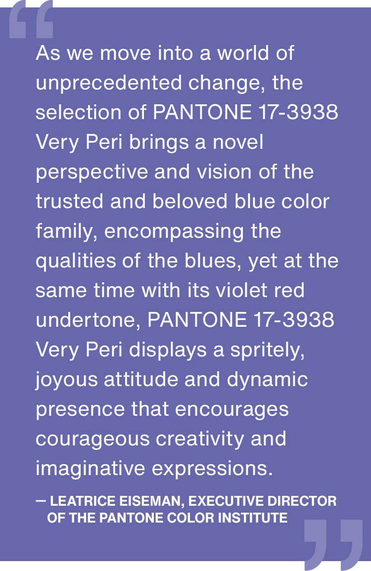
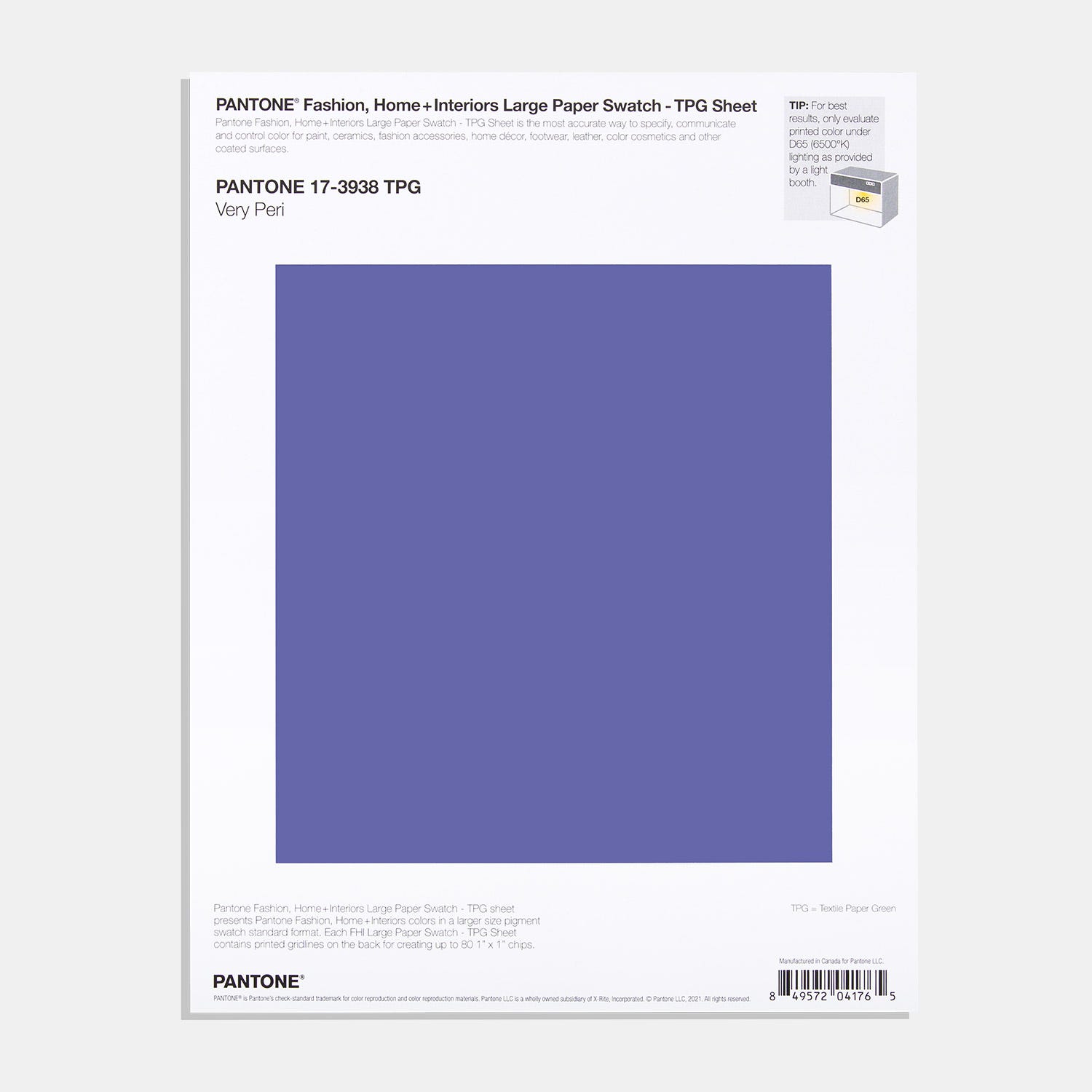
Each year Pantone comes out with a color of the year. 2022, here we are. Pantone 17-3938 Very Peri has an optimism that doesn’t match the news cycle and a coldness that reinforces the winter of our discontent.
 Purple is not my favorite color. Just be red. Or be blue. But both? Gah. But sure, bring on the courageous creativity!