XANADU: Branded from Property to Existential Visual Experience

A private paradise integrated seamlessly into the natural beauty of the Sound, this modernist fantasy is poised to be emergent. And, offered at $12 million or the cryptocurrency of the buyer’s choice, it’s ready for the discerning buyer who’s tapping into the next trend in luxury real estate: buying on the block chain.

With an entire floor dedicated to wellness – a yoga room, fitness center, squash court and indoor/outdoor pool –11 Bluewater Hill lives up to the definition of her name: Xanadu…an idealized place of great or idyllic magnificence and beauty.

Our Dot Think team was chosen for the exciting task of building an experience that matches Xanadu’s effortless grace, power and beauty while communicating her purpose as a haven, a breath, a respite, a home.

Visuals for such a modern and progressive space must be as avant garde as Xanadu’s character. Leaning toward the inventive as opposed to the practiced, our task was not rooted in what luxury real estate marketing is doing, but in what Xanadu is saying.

The branding, logo and iconography we crafted speak to the name and the ethos of Xanadu: a mythical place where one can indulge every fantasy. Icons were created to represent the five elements of nature, and connected to elements of the property: Earth (architecture), Water (pool), Fire (living spaces), Air (rooftop and views), and Space (exterior spaces).

We then created a custom website to showcase Xanadu’s avante-garde elements of design and coveted views of Long Island Sound, sculpting a rich visual experience for visitors. And, with a print invitation and on-brand email marketing, we channeled Spaces’ unique voice and presence to amplify and elevate their presence in Connecticut’s luxury real estate market, inviting prospective buyers to explore this modern-day pleasure palace both in the metaverse and IRL.

Even among exclusive and luxury spaces, property websites and branding can have a cookie-cutter feel and outdated user experience., It was our delight to innovate a branding and marketing experience for Spaces that takes luxury real estate marketing to new levels.

Spaces Connecticut
Bespoke services that connect with buyers

Every space has its own unique story and aesthetic. Carrie & Virginia, a mother and daughter real estate team, have a passion for capturing that essence through targeted long-term strategy. They make properties shine above the noise through high-end video, online brochure pages, events and tailored marketing.

Learn more Spaces, named the top luxury team 2020 by ReMax Heritage, on their website, also by Dot Think Design.

Dot Think Design
As a woman-owned & operated agency based in Fairfield County, Connecticut, Dot Think Design serves businesses and nonprofit organizations across the US with branding and marketing strategy, print and web design, social media and email campaigns. Clients include the Breast Cancer Research Foundation, Harvard Business School Precision Medicine Accelerator, Lululemon and more.

A Sustainable Love

It is a rare privilege to collaborate on a project that is deeply rooted in love. Not just an easy or convenient love. But one that takes care, consideration, patience, and ultimately, sacrifice. One might say this is the only love that can last. That is sustainable.

Bestselling author and Elephant Journal founder Waylon H. Lewis fundamentally believes in that kind of love, not just for ourselves, but for the planet. That is not simply a sound bite for marketing. Lewis partnered with Dot Think Design for the daunting task of designing a fully modern, sustainable book to fall in love with ourselves.  

Dot Think worked closely with Waylon to create snapshots of moments, strategies and experiences of every day life. Each page a vignette of it’s own is strung together in a series of 108, a significant number in Waylon’s tradition of Buddhism. The illustrations, hand drawn by Waylon himself, were converted to high res art and thoughtfully placed through the book and cover. Unlike most print projects, Waylon and Corti spent time on a screen share, moving images and type around as if playing in a zen garden. It was truly a magical process.

There is such an ethical premium on literature and books that few people know how toxic they are to the environment. Most works are printed with toxic inks and plastic covers at remote facilities then delivered by climate-heating container ships. For Lewis’ latest book, It’s Never too Late to Fall in Love with your Life, the cover, inks and print production were as sustainable, eco-friendly, and carbon neutral as possible. 

Printed locally with carbon-sucking algae instead of ink and a cover that is literally the only cloth available that is plastic- and plastic-coating free in the whole world, this design took time, care, consideration and hard choices. We could not be more proud of the results. 

This is Lewis’ second book and he describes it as: “Chock Full with Buddhist wisdom, environmental tips, activism, and life lessons learned the hard way (made accessible so you might learn ‘em the easy way)…this carbon-negative,

plastic-free gift book opens up a life of meaning, caring, change, and joy for a world in need.” Read it and buy it at shop.elephantjournal.com


Waylon H. Lewis

Waylon Lewis is the founder of elephant magazine, elephantjournal.com (named Top 10 in US for Green) and host of “Walk the Talk Show with Waylon Lewis” (named “Top 10 green video in US” by MNN). Born in Boulder, Colorado, Waylon graduated from Boston University’s top-ranked magazine journalism school, was named Naturally Boulder entrepreneur of the year in ’07, Top Denver-area Single by 5280, “Green Hero” by Discovery Network’s Planet Green and “Changemaker” by Treehugger, “Prominent Buddhist” by Shambhala Sun magazine, and #1 on twitter in the US for #Green content (Shorty Awards). Recently, Waylon was named Treehugger’s “Best of Green” Reader’s Choice Eco Ambassador in Culture & Celebrity for 2010. A featured columnist for Huffington Post, Waylon is a 365-day bike commuter, mediocre and lazy yogi who aspires to help change the world for the better (and get filthy rich), have 12 children (and only one wife), run for President (and lose), and have fun all along the way.

Learn more about Waylon Lewis 


Dot Think Design

As a woman-owned & operated agency based in Fairfield County, Connecticut, Dot Think Design serves businesses and nonprofit organizations across the US with branding and marketing strategy, print and web design, social media and email campaigns. Clients include the Breast Cancer Research Foundation, Harvard Business School Precision Medicine Accelerator, Lululemon and more.

DotThinkDesign made sure that the beauty of this composition goes much deeper than what’s written on the page, although we did design the book and cover. Most works are printed at remote locations or factories then delivered by climate-heating container ships. This book is locally printed and compiled supporting good-paying jobs with benefits using non-toxic inks. We are proud to be an intricate partner in such an eco-friendly undertaking that makes a very sustainable finished product. 

3 Black Graphic Designers Who Made (and Are Making) History

written by Lindsey Parker, Project Manager at Dot Think Design

Black History Month is a time to celebrate the contributions and impact that Black Americans have on our culture and society.

And, as the month closes out, we are spotlighting these three designers who have shaped graphic design but have not been given the recognition they deserve and have earned. These designers made and are making a positive (and beautiful) impact on our culture, society, and as a result, the world.

Thomas Miller

For the large part of his career, Miller worked for Morton Goldsholl Associates and was behind some of the most iconic corporate brands in America. He was the chief designer behind the iconic 1970s 7Up rebrand and worked on the team that designed logos for Motorola and the Peace Corps.

Despite the adversity Miller faced, he never gave up on his dream to become a professional graphic designer. After graduating college, he enlisted in the army during WWII and was sent to Europe. While overseas and even in quite difficult conditions, he found ways to express his creativity. The story goes that he made friends with a supply sergeant and was able to obtain some paints and used surplus army cots to paint on. Apparently, he even sold a few landscapes during his tour. When he returned home, he took advantage of the GI Bill to attend Ray-Vogue School of Art in Chicago and graduated with a degree in commercial and graphic art.

In interviews, Miller talked about the racism he faced. It wasn’t the violent racism of the Ku Klux Klan; it was the polite racism of corporate America. He was told he was talented but too dark. And one potential employer offered to hire him but only if he sat behind a screen so no clients would see him. In interviews, Miller spoke about his appreciation for Millie and Morton Goldsholl, who hired him as one of their first graphic designers when they opened their design firm. The Jewish American Goldsholls sought to create a workplace where white Americans, African Americans, Japanese Americans, men and women worked together as equals.

After Miller retired from Goldsholl’s, he stayed committed to the Civil Rights Movement and was commissioned to design the murals for the DuSable Museum of African American History. He made Harold Washington, Chicago’s first Black mayor, a central figure.

“Miller built his mosaics out of translucent plastic squares made from egg crate light diffusers, the mesh squares that filter light from overhead fluorescent bulbs common in late-twentieth-century workplaces. Harkening back to his army days, Miller sourced the material from offices around the city and broke them down with the help of his children. He hand-painted each tile—thousands of them—and assembled them into a pre-planned grid. At once homespun and carefully executed, Miller’s mosaics refracted the ‘light of his 7Up campaign to envision a reconstructed Chicago. Each tile had to be placed at a precise angle, he explained, ‘to catch the light.’” – AIGA.org
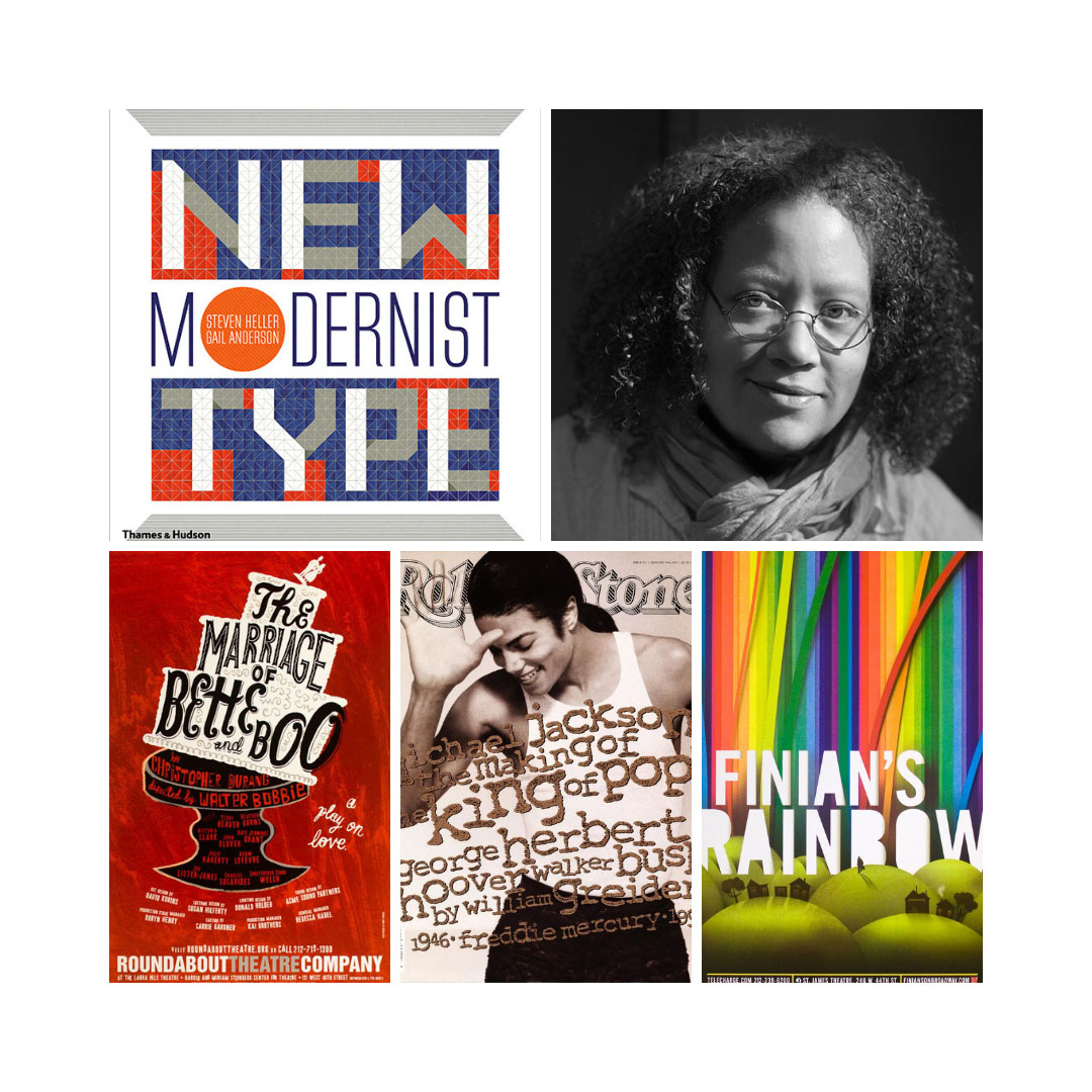
 

Gail Anderson

Trailblazer Gail Anderson is an NYC-based designer and educator. Anderson has received awards from the Society of Publication Designers, the Type Directors Club, AIGA, the Art Directors Club, Graphis, Communication Arts, and Print, and her work is in permanent residence at the Library of Congress. She has co-authored several books on design, is a teacher at the MFA Design program at the School of Visual Arts, and has lectured at colleges and design organizations throughout the country. She also serves on the advisory board for the Adobe Design Achievement Awards. Anderson designed the 2013 Emancipation Proclamation US postage stamp. She is the first woman of color to be honored with the American National Design Awards’ Lifetime Achievement from the Smithsonian Design Museum in 2018, and only the third woman.

Gail has commented on the disappointing lack of diversity in design.

“I wish we didn’t have to talk about this stuff in 2019; to have to make an effort to be diverse, but that’s still the reality of our business. There are resources out there and consultants to help if you’re willing to acknowledge the need for an office or studio that reflects a variety of voices and experiences. I hope that in a decade, employers won’t need outside help, but we’re just not there yet.”

You can learn more about her and see her work here.

Sylvia Harris

Sylvia Harris is referred to as the Citizen’s Designer. Growing up in Virginia during the civil rights movement gave her a unique understanding of people and how they are affected by social systems. In the 1970’s she worked at The Architects Collaborative, where she was introduced to environmental graphic design for the first time. This job set the tone for her later achievements.

After leaving The Architects Collaborative she earned her graduate degree, and in 1980 she co-founded a design consulting firm, Two Twelve Associates, focused not on selling things but instead creating access to the tools and places of public life. This led to her seminal work for Citibank, where she designed the first ATM interface, which set the early standard for automated customer service.

After leaving Two Twelve she founded Sylvia Harris LLC, where she shifted her focus to design planning and strategy. Her work at Sylvia Harris LLC guided some of the nation’s largest hospitals, universities, and civic agencies through systems planning, policy development, and innovation management.

Sylvia is the brains behind the design of the 2000 Census for the United States Census Bureau. Her life experience influenced her user-centered form redesign with the goal of encouraging under-represented citizens to participate.

She believed, “Just as architects and planners should remember that they are creating places for real people, we communications designers are creating useful tools for those same real people, and we must never forget that.”

Purple is my least favorite color.

Here we are in 2022. Still in the midst of a pandemic, on the brink of war, and in the middle of massive social disconnect and upheaval. Black seems like a good color (hello darkness my old friend). Or maybe red (warning!). But somehow we find ourselves in the year of periwinkle / lavender / purple-ish.

Pantone (combining ‘pan’ and ‘tone’ means ‘all colors’) developed the first color matching system in 1963. This system allows designers like myself to see the exact color ink will look like on paper, while enabling printers to use that same standardized system to match the ink color on the final piece.

Each year Pantone comes out with a color of the year. 2022, here we are. Pantone 17-3938 Very Peri has an optimism that doesn’t match the news cycle and a coldness that reinforces the winter of our discontent.

Purple is not my favorite color. Just be red. Or be blue. But both? Gah. But sure, bring on the courageous creativity!

Get to the top of Google: decoding the difference between SEO & SEM

You want your website to get to the top of the search engine results so more potential customers can find you online. But wait – do you need to start with SEO or SEM? And what’s the difference? Where does PPC come in? And what’s with all the acronyms, anyways?

Wading through the technical terms can seem daunting, but never fear. We can help  decode the mysteries.

SEM (Search Engine Marketing)

Your strategy for getting to the top of Google.

Simply put, Search Engine Marketing (SEM) is your big-picture strategy for how you utilize the search engines to get people to find your business and products.
What are the elements of my SEM?

  1. Strategy: Defining your key products and the best use of tools and channels to market them. (This step is key before you optimize! Work with us to build a custom strategy for your unique product.)
  2. Search Engine Optimization: Optimizing your site so that it comes up on the first page of Google in the organic results.
  3. Pay-Per-Click / Google Ads: Paying Google to show your ad on the first page of results. You only pay when people click.
  4. Display Network Ads: Reminding users of your awesomeness after someone clicks through to your site from a Google Ad, through remarketing ads that follow them around the Internet.

SEO (Search Engine Optimization)

Your long game for capturing organic traffic.

Search engine optimization is how you get to the top of organic search results. Google uses a combination of search volume, relevancy and clickthrough rates to determine whether you appear on the 1st or 88th page of Google for any particular keyword.

What is organic search? In layman’s terms, these are the authentic search results that appear for a keyword search. For example, when Donald Trump got upset that his name appears in Google when you type in “idiot,” that was because “idiot” was the most relevant term for his face.

How do I optimize my site?

  1. Keyword Research: Find the keywords that people are actually searching and are relevant to your business.
  2. Site Optimization: Incorporate high-value keywords into your headlines, body copy, images, and site metadata. (Optimization is both a science and an art! Talk with us about how we can optimize key pages across your site.)
  3. Ongoing Content: Write blogs about the topics that people care about most (based on keyword research), optimize them for search and then send them out to all your channels to get the ball rolling.

PPC (Pay-Per-Click) / Google Ads

Driving results by paying Google for clickthroughs.

Are you running a campaign around a specific event, giveaway or deadline? Pay-Per-Click (PPC) advertising is a fantastic way to quickly get people on your site to purchase your product at times when it is in high demand – think tax season for accountants.

PPC is also a great strategy to increase leads in the short-term by sending folks to a page that features a data capture. Once you have their email or cell number, you can then remarket to users in the longer term. You can combine this with Display Network advertising – banner ads that follow users around the internet – to increase brand awareness and keep your products top-of-mind.

Where to start? Digital strategy around business goals.

At Dot Think, we don’t want your money if it isn’t going to get you results that help move your business forward. We work closely with you to look at your current traffic, analyze your current marketing efforts and put together an actionable set of digital marketing goals that fit your yearly marketing budget. Talk with us today about how we can help you reach your goals.

Mindful marketing to amplify mindful living.

Dot Think’s digital partnership helps Elephant Journal spread the good life beyond the choir.

Elephant Journal is the internet’s leading resource on modern mindful living and has been working to share unique perspectives, eco-living and mindfulness for almost twenty years.

In a technology-driven design partnership, Dot Think and Elephant Journal work together to  design and develop themed months that speak to target demographics – from self-care and eco-living, to intimacy and motherhood. And every month, Elephant Journal collaborates with a mindful partner innovating in the same space.

Dot Think designs and develops custom landing pages to support monthly themes, complete with unique theme logos and imagery. Working closely with the editorial team at Elephant, we change out imagery, develop creative and ensure pages are optimized across devices and browsers. Once launched, Dot Think assists in campaign rollout with graphics and ad placements across email, social and on-site placements.

With themed landing pages drawing an average of 25,000 visitors per month, Elephant Journal readers are truly enjoying this editorial and design curation of mindful media.

Bridgeport Arts Trail – November 8th – 11th

As a graphic designer, board member at Bridgeport Arts & Cultural Council and the daughter of a career fine artist, I’m excited to invite you to be part of a weekend that’s close to my heart: the Bridgeport Arts Trail, happening the weekend of November 9th.

All across Bridgeport this weekend, artists are opening their studios for a vibrant and exciting weekend that will fuse visual art, live music and curated events. As a graphic designer, board member at Bridgeport Arts & Cultural Council and the daughter of a career fine artist, I’m thrilled to be both a supporter and participant of the Bridgeport Arts Trail.

The Bridgeport Arts & Cultural Council is on a mission to empower the community of Bridgeport to  transcend challenges and thrive through the transformational power of art. Sparked by pain or joy or longing, art can invite us to embrace beauty, rally us to resilience, and unite us in a common experience of our human condition. Created from an artist’s inner song, art holds the power to lift us above our daily grind so we can play sweeter music. This weekend, we support the community of artists that call Bridgeport home … and become part of the collective experience of joy that happens when we celebrate what it means to be creative beings.

Join me on the trail at the following events. Take home a new piece of art, or simply be inspired by the magic of creation.


BLOCK PARTY
presented by the Bridgeport Arts & Cultural Council.

Friday 9th, 5-10pm
1123 – 1163 Main Street
Downtown Bridgeport

5 Events. 1 Night. Same Block.
Collaborative Retail launch.
3 Art Exhibits.
Live Art.
Design Discussion.


CORTI OPEN STUDIO

Saturday November 10, 10am-5pm
Dot Think Open Studio – AmFab Arts Building
1069 Connecticut Avenue, Bridgeport

10 am to 5 pm:
Join Artist Kit Corti, Designer Corti Cooper and Vintage Clothing Collector Sharon Shaw in Dot Think’s studio space as part of the Bridgeport Art Trail.

3pm:
Join yoga and meditation teacher Corti for a moving meditation as Kit creates gesture drawings of participants.

See you on the trail!  Explore all the events.

INTRODUCING: The 2018 color of the year is…Ultra Violet!


Open Your Mind’s Eye to Intuitive Ultra Violet (18-3838)

The 2018 pantone color of the year is confirmed. Selected for its inventive and imaginative qualities, this shade of purple is surely set to influence art, design and the runway. But don’t think this is JUST a fashion statement. Truly setting a “tone”, the pantone color of the year is chosen to reflect current cultural shifts.

We are living in a time that requires inventiveness and imagination. It is this kind of creative inspiration that is indigenous to PANTONE 18-3838 Ultra Violet, a blue-based purple that takes our awareness and potential to a higher level. From exploring new technologies and the greater galaxy, to artistic expression and spiritual reflection, intuitive Ultra Violet lights the way to what is yet to come.

Leatrice Eiseman
Pantone Color Institute Executive Director

Read more of Eisman’s statement here

Ultra Violet in Our “Extra” Lives

Associated with technology, mindfulness and spiritual discovery, Ultra Violet encourages us to feel deep and expand out. Taking a step back, we live in amazing times and technology is making astonishing advancements. But of course it is not without growing pains! In an information rich world, little remains below the surface for long. Ultra Violet reminds us that amid much digital stimulation and digging up of truths, we would do well to connect back to ourselves and to each other.

Here at Dot Think, we are so on board. Honoring the power of our combined intuition, we thrive in the realms of discovery, design, and story-telling (all with the seamless integration of technology). We also recognize the sacredness of balance and re-connection. On our downtime you can often catch us in a yoga studio, the beach, or reading up on political #resistance.

As this bluish-purple glow casts a light on our world, we you invite you to look up – The galaxy is the limit!

:::

The Pantone Color Institute is a consulting service within Pantone that forecasts global color trends and advises companies on color in brand identity and product development, for the application and integration of color as a strategic asset.

Dot Think Design is a woman-owned & operated agency based in Fairfield County, CT that serves nonprofit and for-profit organizations across the US with branding and marketing strategy, print and web design, social media and email campaigns, technology solutions and development.

LEARN MORE ABOUT US